Kellyn Roth Color Palette Case Study
Come behind the scenes to see how I brought this creative project to life
.
This is a deep dive into a client project I featured here.
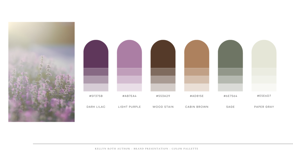
Kellyn had some color suggestions and a general design aesthetic in mind. She already had two purple colors in use on her website and graphics. She wanted to incorporate more of a rustic color palette that would meld well together with current image colors and the purple brand colors.
Kellyn wanted her aesthetic to be “Vintage cottagecore academia, feminine but a 20th century way.” She also gave me a Pinterest board with some colors and branding elements included.


I added two browns to bring in the rustic touch as well as tie back in to the cabin images she wanted to incorporate into her branding. The sage green brings in the colors from the wildflower images and elements we added throughout the branding process and also enhances the purple colors already in use.
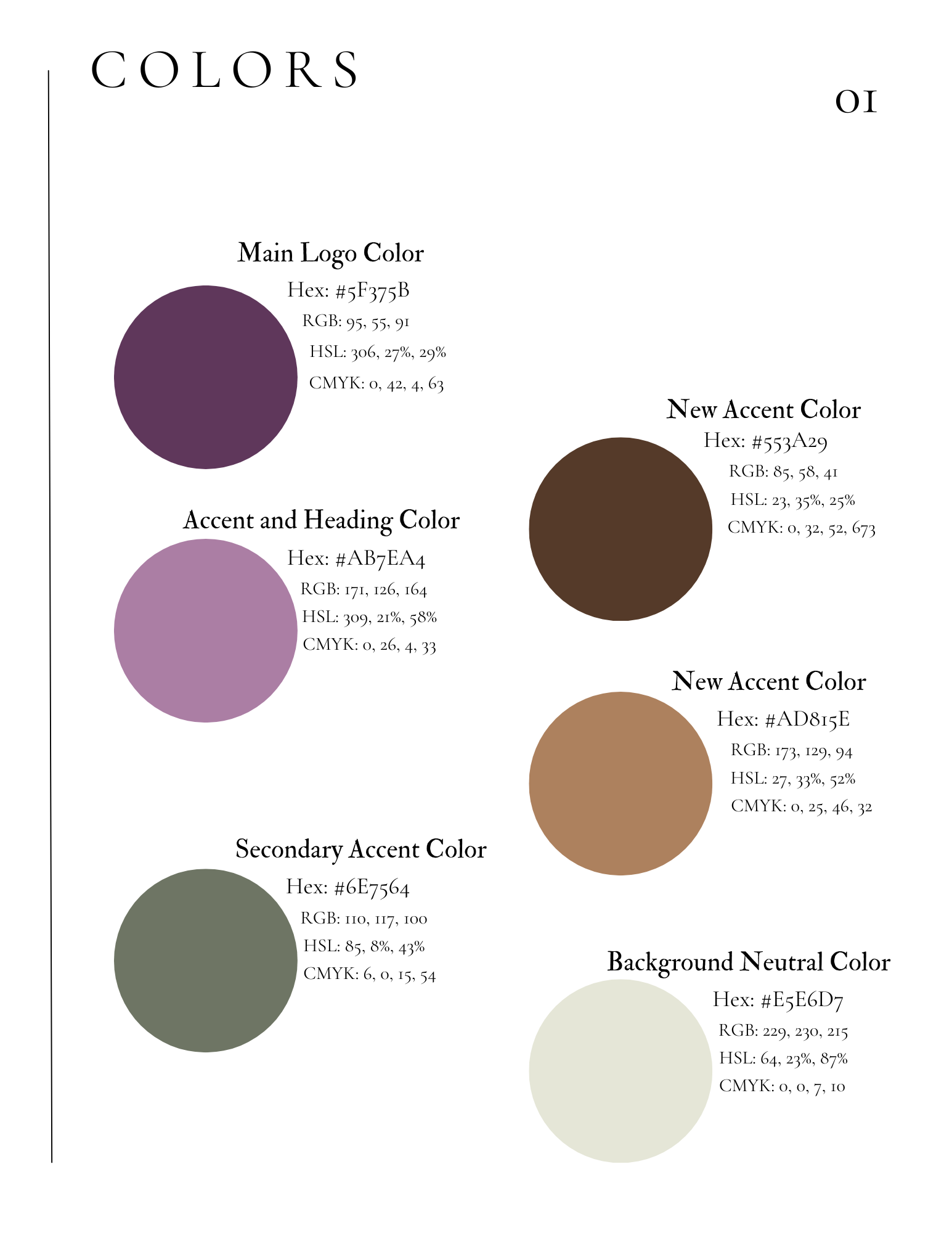
In my Brand Guide delivered to Kellyn during the project, I clearly laid out the colors alongside their uses and colors codes, so she could use them in future projects as well as clearly explain to any other designers that might work with her in the future.